
In all previous retreats a single banner was created and then placed on all collateral. This year I decided to craft a holistic design system that could be applied with more variance. I selected a few members of the marketing team from different departments that would be assigned to the project to help brainstorm ideas, provide constructive criticism, and give final reviews before we took it to the attorneys.
Partners’ Retreat 2019
Theme concepts
At our first branding team meeting, I presented four concepts to discuss. Theme one garnered a unanimously positive and excited reaction, however we all agreed that within the confines of a law firm event it pushed the envelope a bit too far. In the end, the consensus was to find a middle ground between themes three and four with a strong nod to the new firm website. One of the ways we wanted to achieve that was to incorporate the sketches done for us by Nicholas Bleckman of The New Yorker.
Communication
Big ideas, loud communication, literal iconographic language, forward movement, growth, creativity, collaboration.
Connections + big picture
All pieces are integral to the whole. Celebrate both differences and similarities. A strong grid unites and provides support.
Connections + movement
Seamless collaboration, overlapping moments, intersections and coming together, transitioning.
Loeb branding refresh
Inspiration drawn directly from the refresh to tie the retreat’s identity to Loeb’s new brand graphics, website, and illustrations.
Digital exploration
At our second branding team meeting I presented a range of exploration via the name badge and masthead designs.
Final digital concepts
Based off of group discussion and critique, I finalized the below three concepts. They were then presented at the managers team meeting, and to the firm chair.


Retreat assets
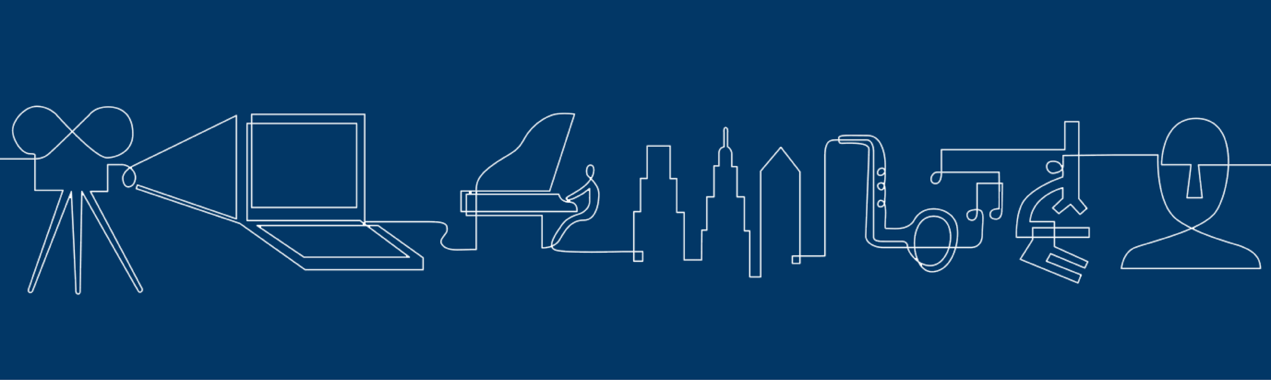
Firm stakeholders chose the second direction and I applied the identity across all event collateral. My concern, however, with this design was that we had drifted back into the old system - a single banner design simply dropped on everything. So I decided to work backwards. Instead of creating a collection of elements that add up a visual system, I dissected the line drawing to create unique pieces in the design system. Some deliverables still used the full banner illustration but I was successful in pushing Loeb out of it’s comfort zone with some items.
Retreat signs
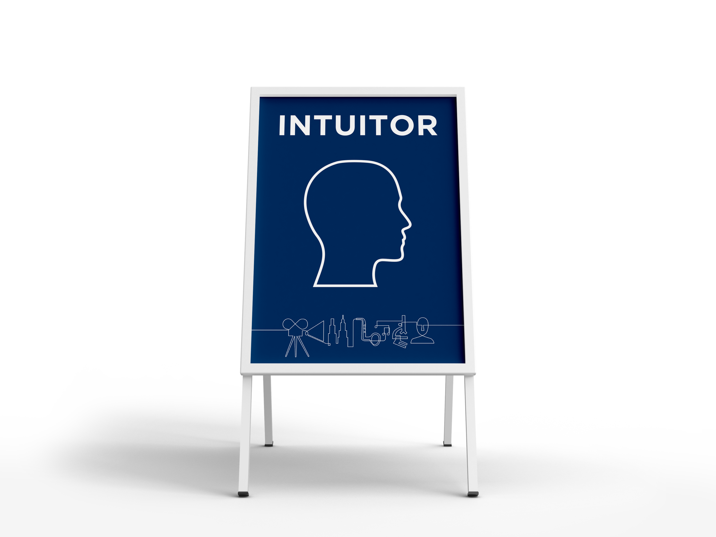
I was responsible for a system of about 72 signs. This included 24x36 inch posters for the four communication style markers (sensor, feeler, thinker, and intuitor) and the tech signs. As well as the event and meeting sign system. These were smaller signs and arrows adhered in pairs to one of the eight 24x36 inch poster bases via velcro. I worked closely with our printing vendor to increase the size of all small covers as much as possible while staying within a certain budget. I also used color, typeface, and kerning to increase legibility from previous years.


Retreat app
For the first time since the inception of the partners’ retreat app, management decided it was time to rebuild it from the ground up to create a more fluid and sleek user experience. I worked closely with our developer from wire-framing the UI/UX through final visual design.


